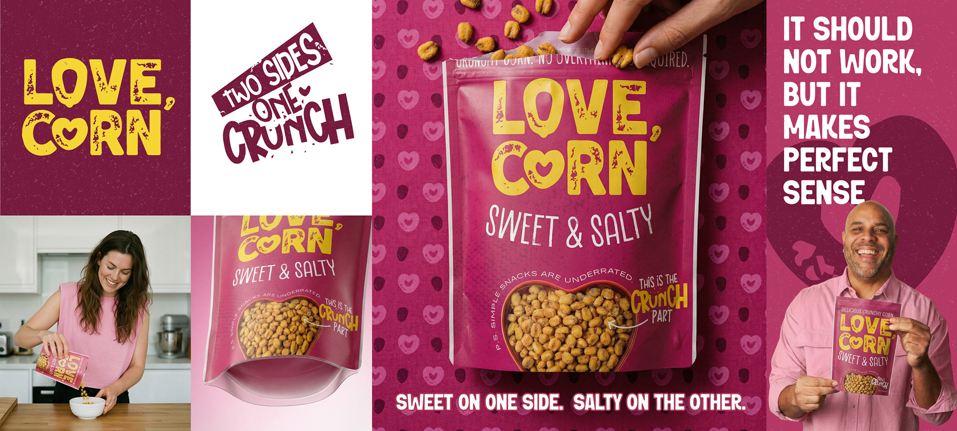
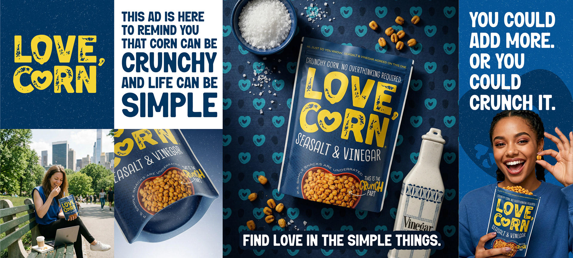
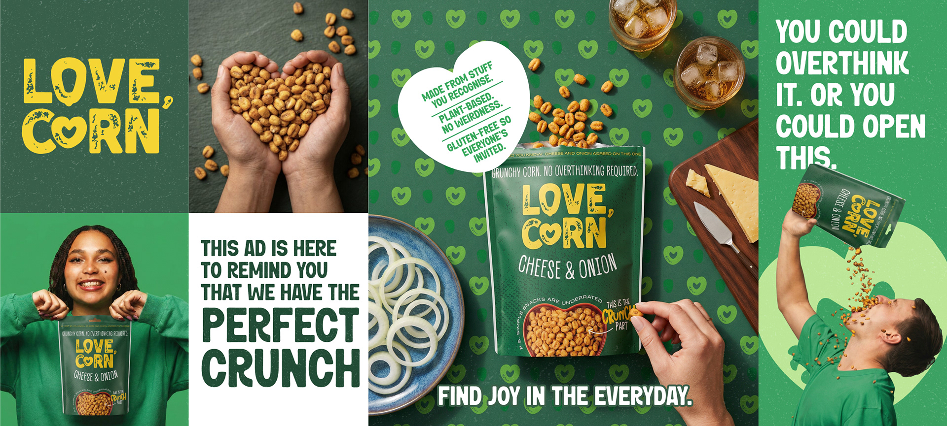
The Challenge LOVECORN had strong awareness but inconsistent packaging. The corn kernel imagery added clutter without real impact. The logo dominated too much space. Flavour names sat at the bottom and were often hidden on shelf. There was no clear design system. Logo colour and hierarchy shifted across SKUs. The range lacked structure and shelf clarity. The Solution Leading the packaging rebrand end to end by simplifying the visual language, removing unnecessary kernel noise and creating a stronger hierarchy. The logo was rebalanced within a fixed framework and color to maintain recognition without overpowering the pack. Flavour moved to a protected, hero position for immediate visibility. A scalable design system was built: • Fixed logo colour rules • Defined flavour colour territories • Clear typographic hierarchy • Structured grid for all future SKUs This transformed the range from inconsistent packaging into a disciplined brand system. The Outcome Improved shelf clarity. Stronger flavour recognition. Greater visual consistency across retail and digital. A confident, system-led brand built for scale.